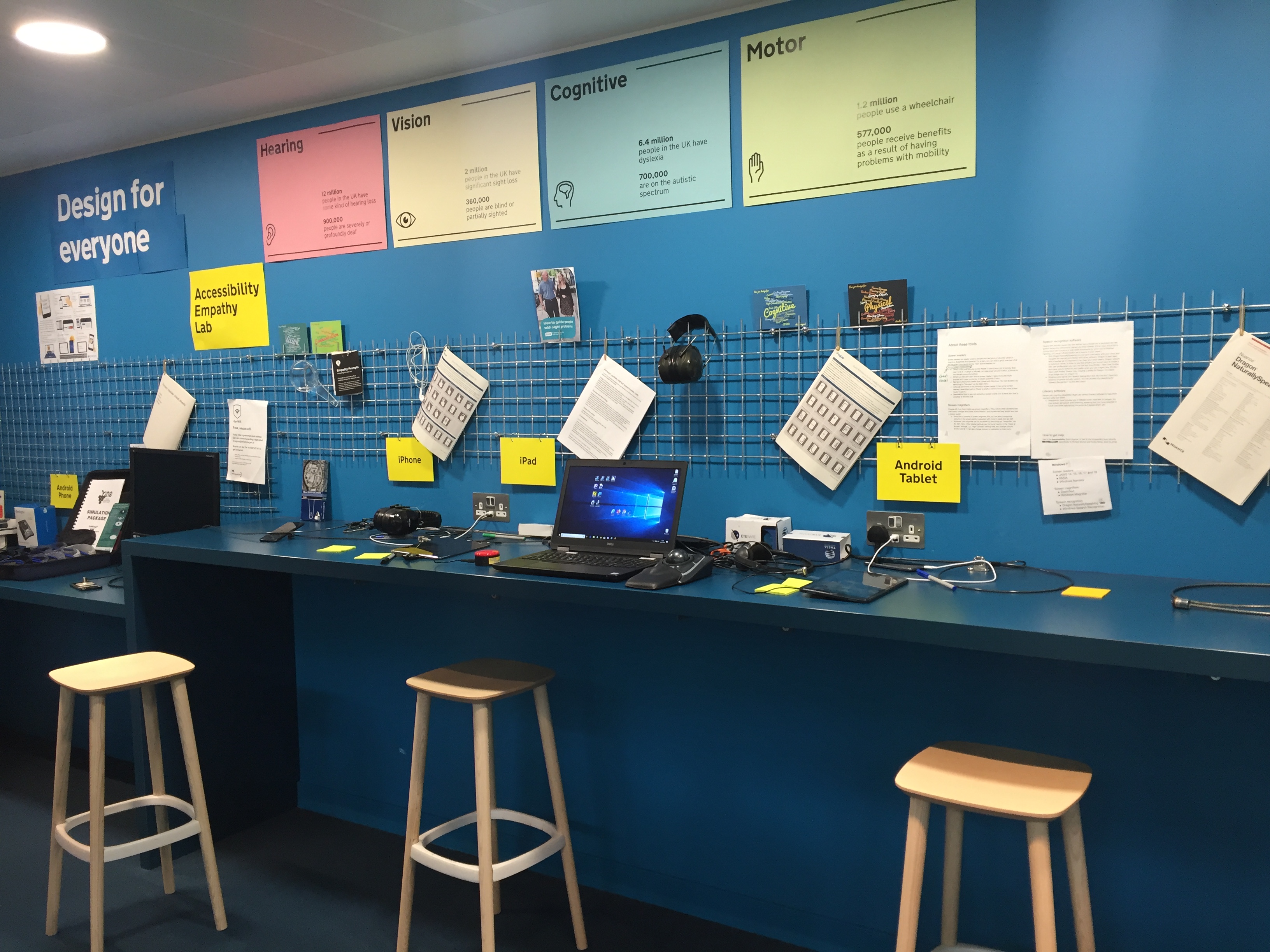
The accessibility empathy lab at the Government Digital Services building
Digital accessibility
I wrote about an accessibility workshop at the recent Sprint 18 conference.
I’ve since been to a more in-depth workshop with Government Digital Service (GDS), who have just launched the latest version of their ‘testing for accessibility’ guidance in the Service Manual and also the GOV.UK Design System, which contains reusable GOV.UK styles, patterns and components with accessibility in mind.
At the session I learnt a bit more about some web-based services that can evaluate web pages against the Web Content Accessibility Guidelines (WCAG 2.0). Tenon and WAVE were mentioned specifically and you can find more in the World Wide Web Consortium’s (W3C) list of web accessibility evaluation tools.
What better way to investigate one of these services that to test it on myself? I’m going to assess the accessibility of my post about accessibility (at time of writing). So meta.
Tenon example
Tenon is a web service that tests for compliance against WCAG 2.01. It reports back on errors and warnings and assigns an order of priority for fixing the problems.
Tenon offers an API for automating accessibility tests. You can test the service in your browser by inputting a URL into the search box on their website.
Output
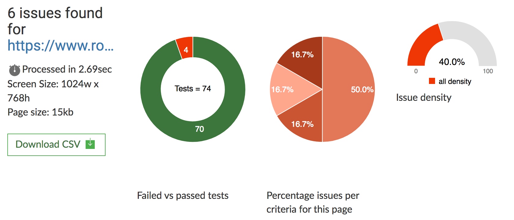
The service reported back that 4 of 74 tests failed for the post.

In-browser results of Tenon’s test
The in-browser output also provides a CSV report of the failures. I’ve hosted my report in a GitHub Gist.
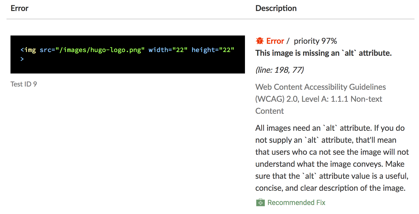
An example of an error is that one of my images was missing alt-text. Tenon reported:
- the line of HTML code causing the error
- the priority for fixing the issue
- the line location in the HTML code
- the specific WCAG 2.0 guideline that was breached
- a description of why this is a problem
- a link to a recommended fix for the problem

Example of an error, where it is, and a recommended fix
Reflection
Not too bad.
The default settings for the blog’s Hugo theme was accountable for at least one issue: the Hugo logo in the footer is missing alt-text, so it can’t be described by a screen reader.
I also had problems where I actually did have alt-text in place. These were identified as being too long. I tried to be as descriptive as possible, but went too far. For example, I used these 24 words for one image:
Thumbnail views of example posters including designing for users on the autistic spectrum, for users of screen readers and for users with low vision
That’s verbose. I could do this in half the number of words:
Posters by the Home Office showing the dos and don’ts of accessibility
The use of implicit headings was also flagged. This was because I had whole lines – audience questions – tagged as <strong> (meaning bold). It would be preferable for all section titles to use the header tags (first-level header is <h1>, second-level is <h2>, etc), since these a recognised specifically by screen readers.
Behaviour change
I will:
- keep my alternative text short but descriptive
- use explicit headers using the HTML header tags (
<h1>, etc) - investigate default settings for accessibility before using them
Other improvements could be made. For example, I also ran the webpage through WAVE web accessibility tool and one of the errors was the low contrast between the white background and the light grey of the date and author name. These could be made darker.
The obvious next step is to assess the accessibility of my post that assesses the accessibility of my post about accessibility. Or perhaps the world isn’t ready for accessibility inception.

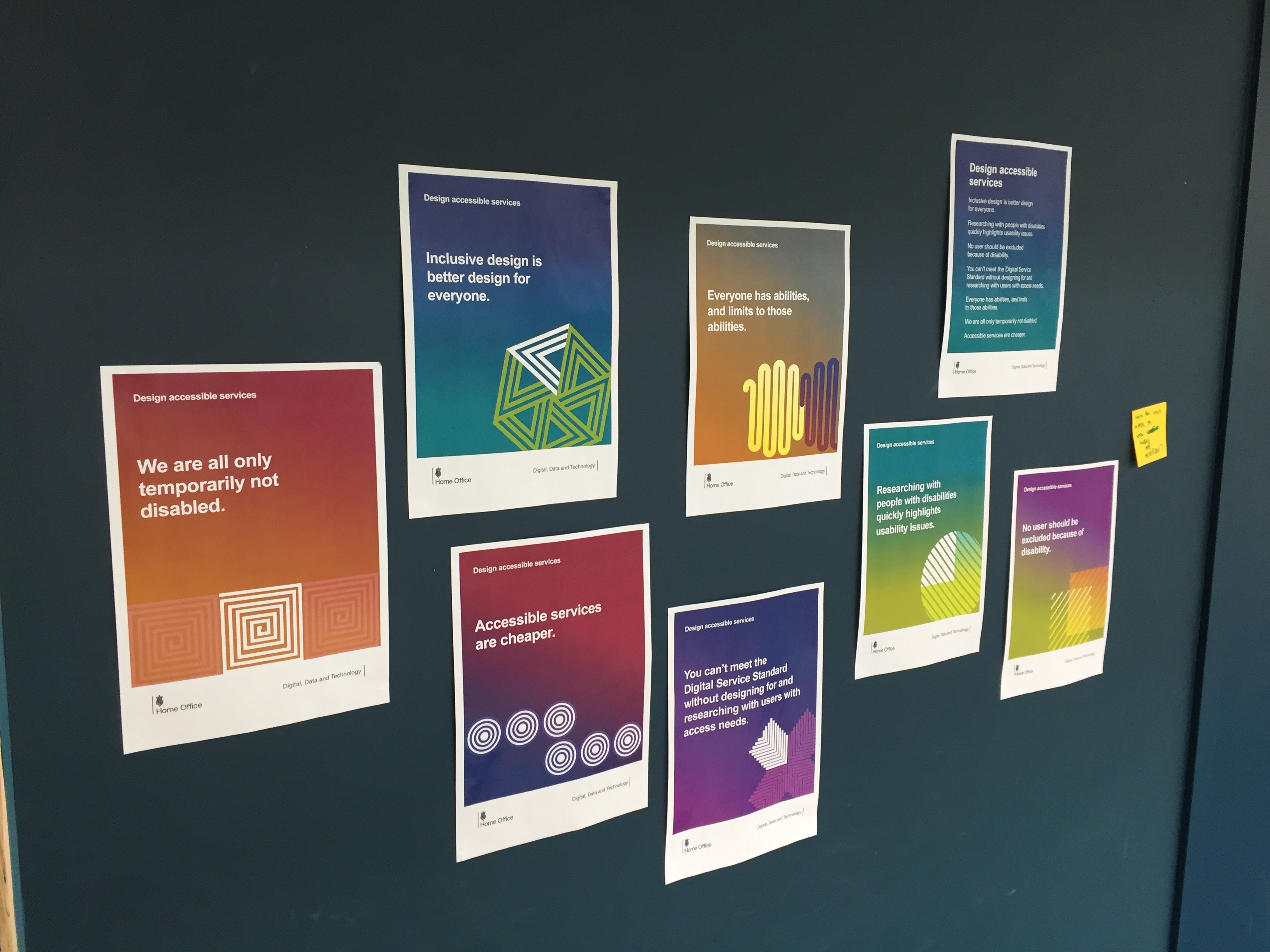
‘Design accessible services’ advice posters made by the Home Office
This is not an advertisement. I mention this service because it was discussed specifically in the workshop. Try out some of the other services available and make your own choice.↩